Background
After I graduated from college, I spent a year living and working in Barcelona, Spain. During that time I travelled all over Europe and (because I was on a tight student budget) I ended up staying in A LOT of hostels. Despite the scary reputation that hostels have earned from their portrayal in horror movies, I took my chances and ended up having a great time! I won't lie... there were a few awkward moments with quirky neighbors and snoring bunkmates but overall I came away with fun memories, great travel stories, and a handful of lasting friendships with people from all over the world.
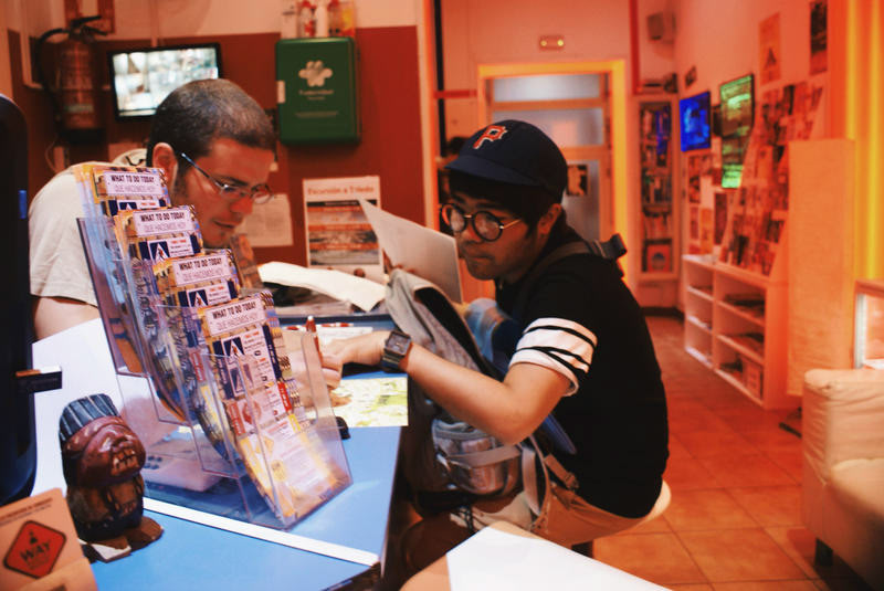
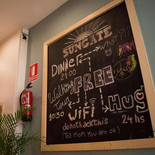
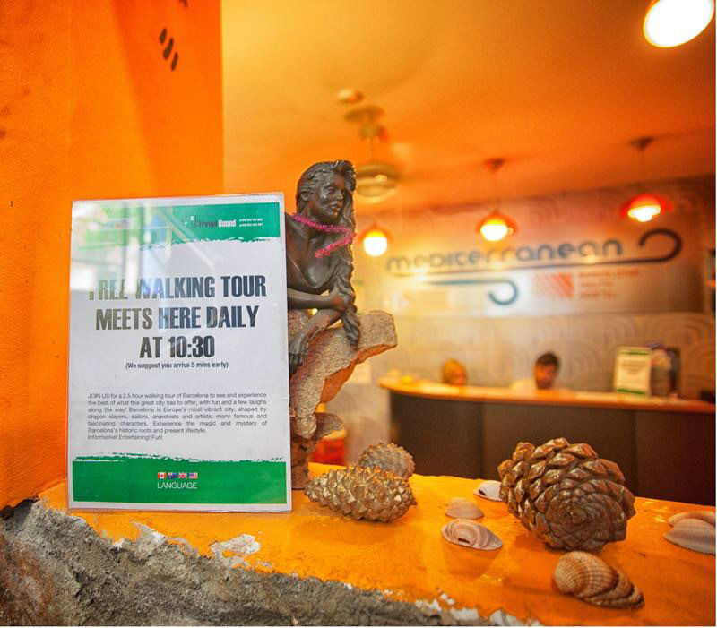
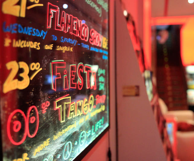

At every Hostel I visited, details about tours and social events were posted at the registration desk.
THe Problem
Throughout my travels I used the Hostelworld mobile app to find and book places to stay. One of my favorite things about staying in hostels was their fun, friendly social atmosphere. In every city, hostels hosted things like happy hours, bar crawls, walking tours, and salsa dancing lessons to help people connect and explore the local culture in unique ways. When using the hostelworld app, I was surprised to see that there was little to no information about these activities online.
The Business Side:
Missed opportunity to capitalize on Hostelworld's main competitive advantage
The UX Side:
Not enough information about event offerings to make fully informed booking decisions
Questions
● What aspects of the app do users find confusing or frustrating?
● Is the current navigation structure straightforward and easy to use?
● Are users able to find a social activity they are interested in participating in at a hostel in their target travel destination?
Goals
● Understand users' paint points
● Identify and prioritize features that are most used/needed by target users
● Determine if a redesign of the Hostel Noticeboard is necessary
● Identify areas of opportunity to enhance to overall user experience
My Role: UX RESEARCHER
● background research
● test design
● test facilitation
● data analysis
● reporting
● recommendation synthesis
Methodology: Moderated Usability Test
I conducted a series of five moderated usability tests during the week of March 4th 2018. The purpose of the tests was to assess the usability of the mobile app interface, information flow, and information architecture.
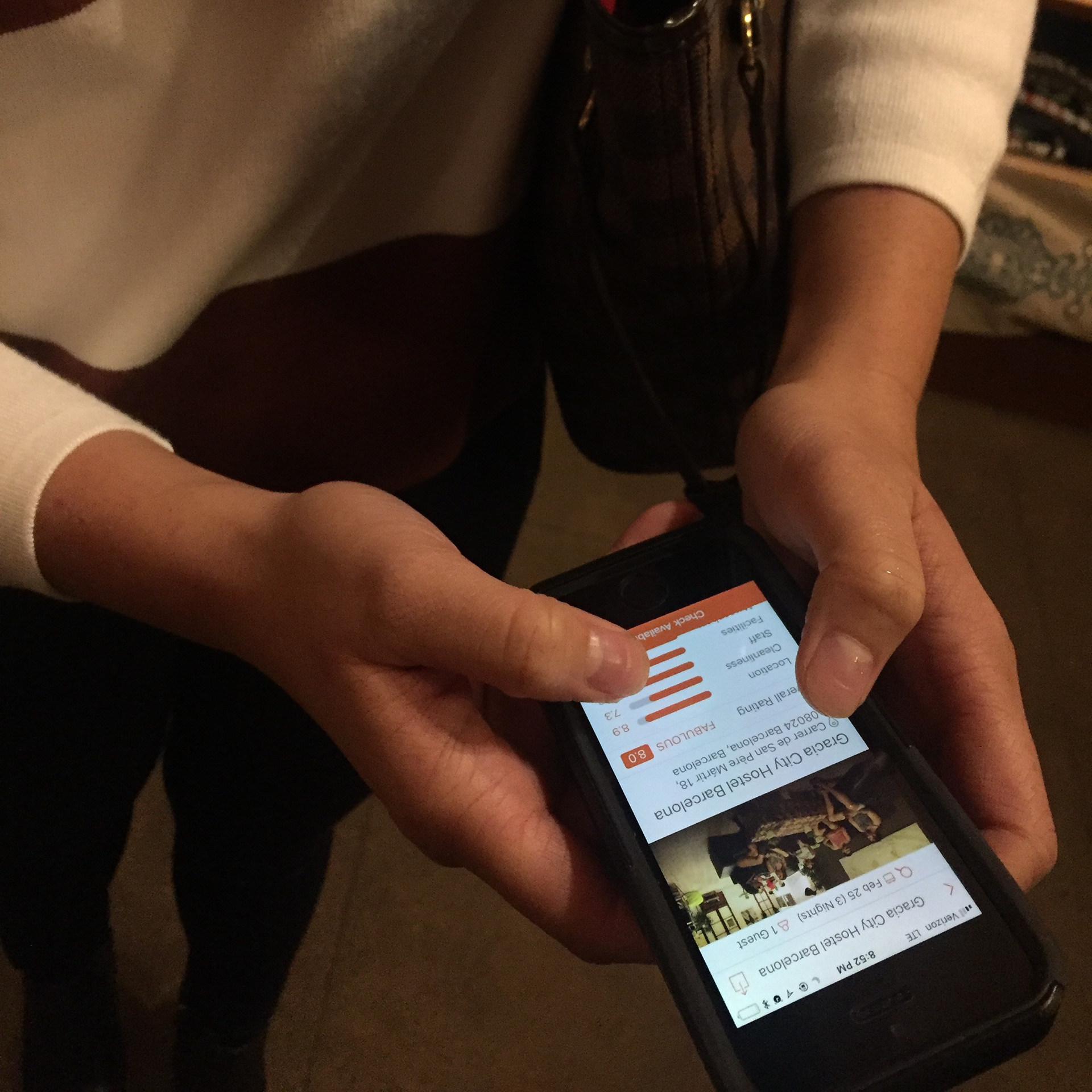
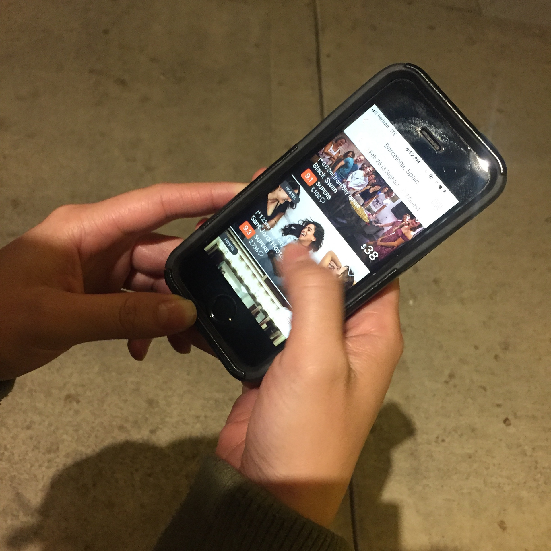
I recruited 5 participants to complete the test. The sessions were conducted in the participants’ homes using a live version of the HostelWorld mobile app on my iPhone SE. One laptop using Photo Booth was placed in the testing room to capture audio and video recordings of the tests as they were conducted. Each session captured participants’ behaviors, comments, questions, and feedback.
Why?
I chose this methodology because I knew it would allow me to interact directly with users. I wanted to be able to sit one-on-one with users, observe their behavior and ask follow-up questions when I wanted more information about their thoughts and behaviors.
The only drawback to this method was finding the right people who were a) fairly frequent travelers b) familiar with hostels and c) in my target age range (18-34 yrs old). Fortunately, through word of mouth and social media postings I was able to find 5 great test participants.
Usability Test Tasks
Task #1
You are planning a 4-night trip to Barcelona during the last week of March. Your maximum budget is $35 USD/night. Please take a few minutes to search and review your options.
Task #2
You’ve heard great things about Barcelona nightlife so you want to find a hostel that will be hosting a “bar crawl” or “night out” during your stay. Please use the app to find a hostel that will be hosting a fun nightlife activity that you would be interested in participating in during your stay.
Results
Insights
Recommendations
Home Screen
● reduce the amount of information in thumbnails - focus on key details (price, ratings, location, etc.)
Filters
● include "sort by" element at the top of search results screen
● replace the price and rating sliders with up/down arrows
● allows users to manually type in price and rating preferences to filter results
Hostel NoticeBoard
● improve feature visibility
● include the feature consistently on all listings
● make the noticeboard searchable
● incorporate event-based filters
● create uniform post format with all essential event details
What I Learned
Travelers Just Want to HAve fun!
Everyone I talked to was really excited about the idea of being able to search for and book hostels based on the fun activities that will be available during their trips and I had a great time talking to people about their travel experiences. Although the conversations sometimes wandered off the test plan, chatting with participants was a great way to build rapport and gather unexpected insights.
Prepare a lot and be flexible
I found that preparing for the usability tests by creating helped me feel ready and relaxed. Because I was prepared, I was able to run the tests smoothly and gather valuable information. Of course, with each test, unexpected things came up (a barking dog, an issue loading the app, video recording glitches, etc.) but I realized that human interaction tests with human participants are bound to involve unexpected turns. By going with the flow and making changes as needed I was able to work through hurdles and complete all 5 tests successfully.