OVERView
Instant Ink is a print supply replenishment service with over 5 million subscribers worldwide. The goal of this study was to test the efficacy of new promotional messaging materials. Stakeholders were interested in implementing more vague language in our printed promotional materials. My job was to test, iterate, and retest new designs to ensure that the new messaging was clear and appealing to users.
My Role: UX Research Lead
● Test planning
● Prototyping
● Insight analysis
● Reporting
Key Questions
● How will users react to a simplified promotional card that does not show plan prices?
● Will users feel they have enough information to activate a free trial and/or subscribe?
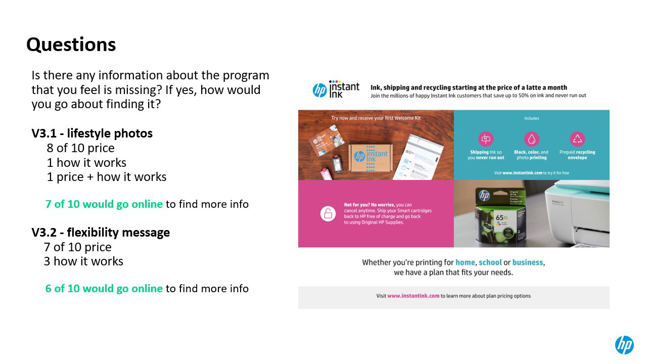
● Will users know where to find more details about Instant Ink if they are interested in learning more?
MethodologY
Unmoderated Usability Tests
3 rounds
50 total participants
Obstacles
Our original plan was to take a multimodal approach combining unmoderated online tests, moderated user interviews, and in-store pilot testing. However, as the COVID-19 situation escalated in early March we quickly realized that any form of in person face-to-face testing would not be an option. Ultimately, I was able to make it work. I carefully structured the online tests to ensure all tasks and questions were clear and concise. Unmoderated research can be challenging - once the tests are launched there is no chance for further clarification or discussion with participants. This experience helped me learn the importance of designing this type of study in an intentional, methodical, detail-oriented way. I now feel I am more well-equipped to succeed as a researcher in virtual environments.
Research - Round 1
Round 1 served as a baseline. I began to identify which elements of the card captured users' attention and had the biggest positive impact on their perception of service. I also took note of points of confusion that needed to be addressed in future iterations.
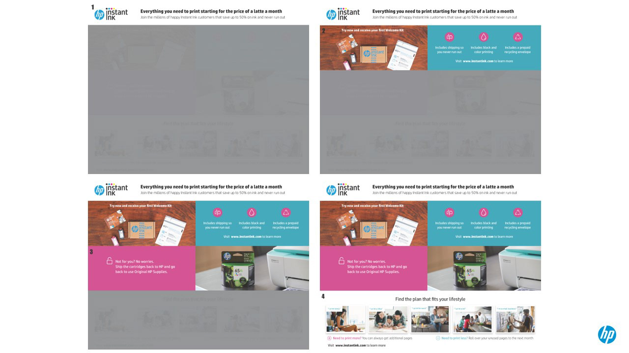
Participants were shown each section of the card progressively and asked to share their thoughts.
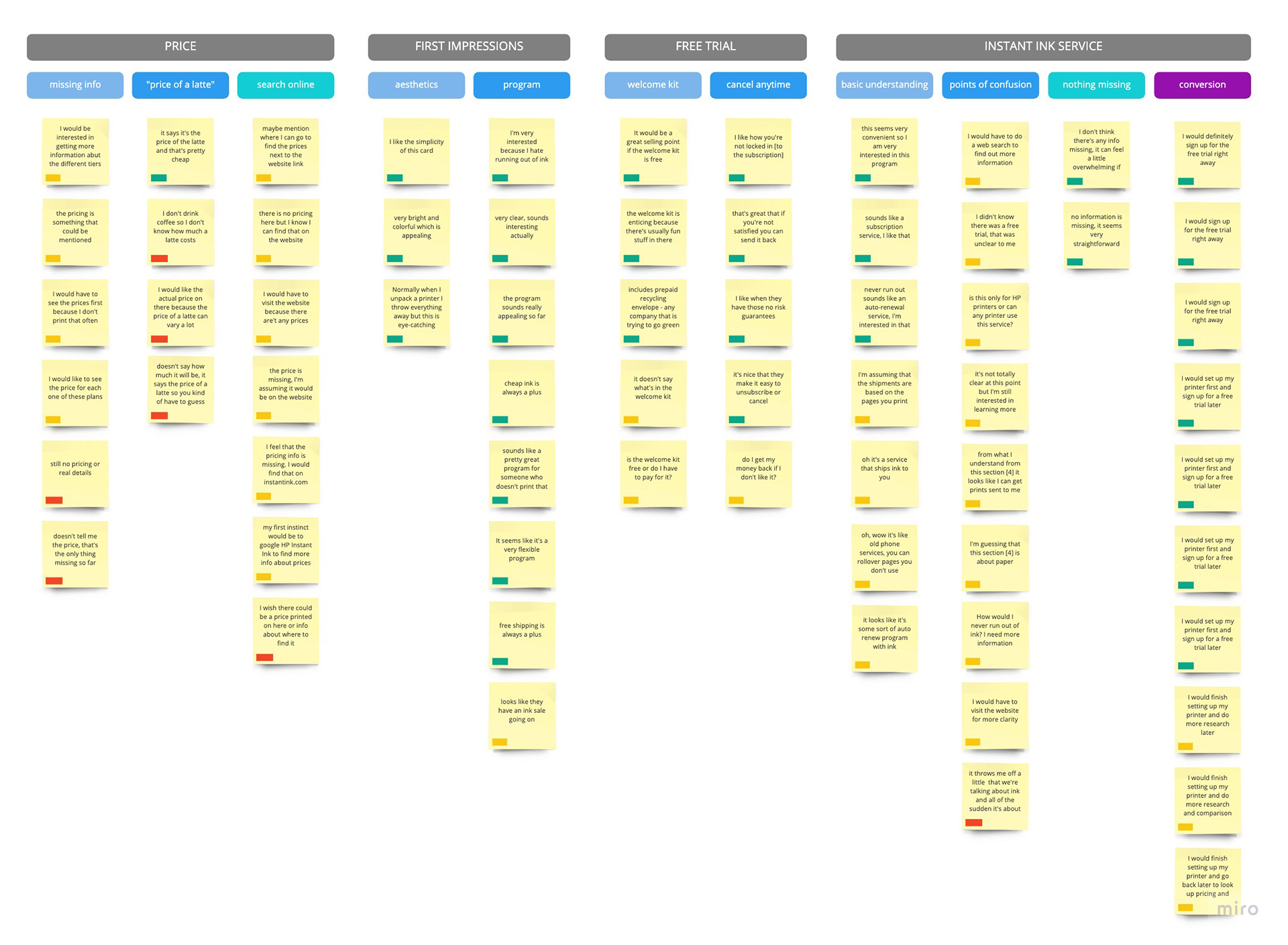
I compiled key quotes from the research into an affinity map.
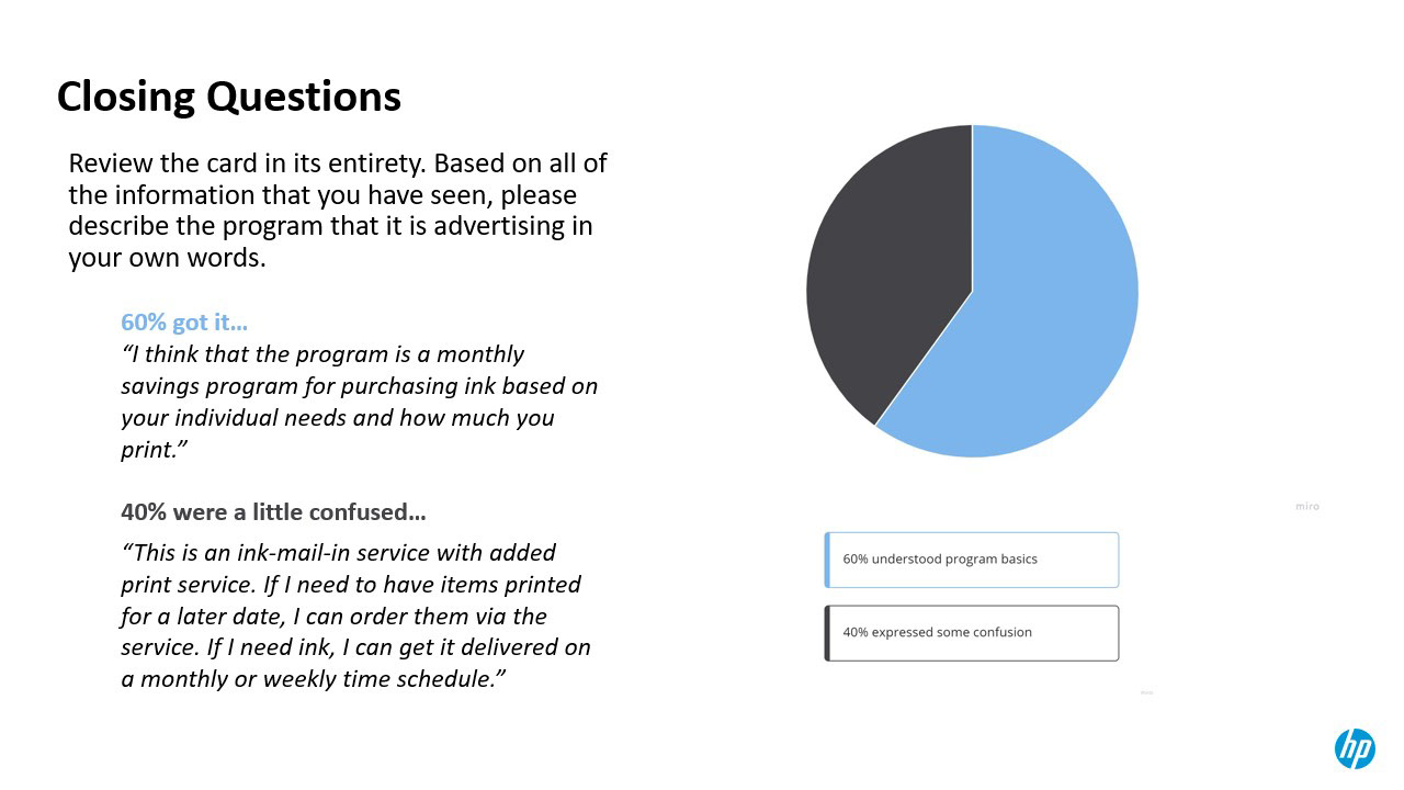
Slide from my internal presentation to stakeholders.
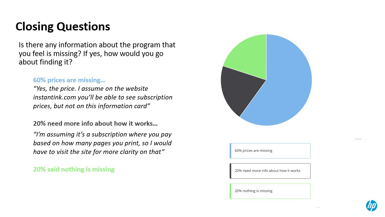
Slide from my internal presentation to stakeholders.
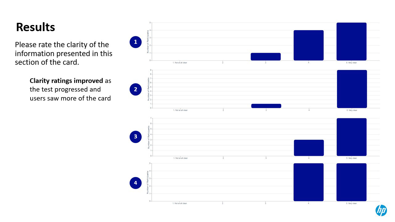
Slide from my internal presentation to stakeholders.
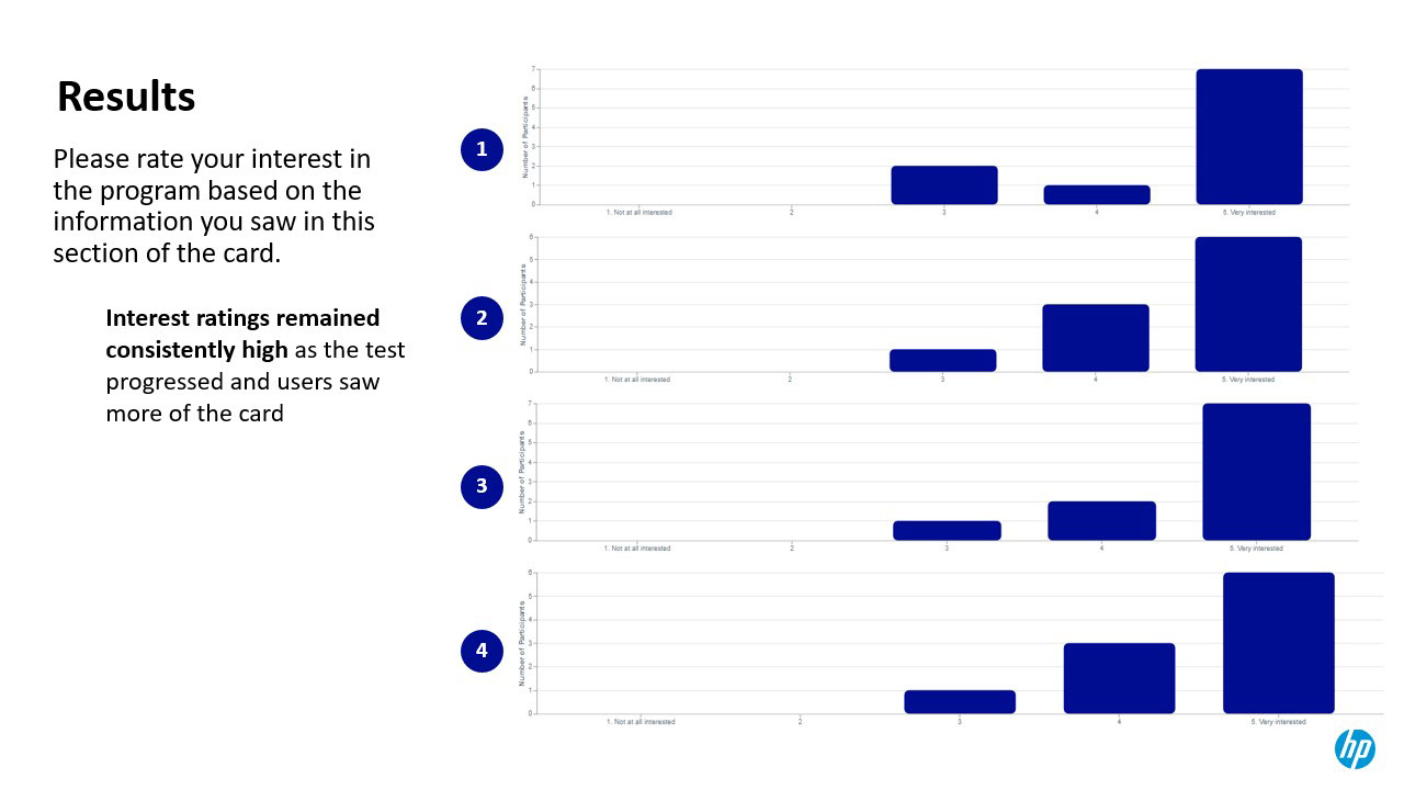
Slide from my internal presentation to stakeholders.
Round 2
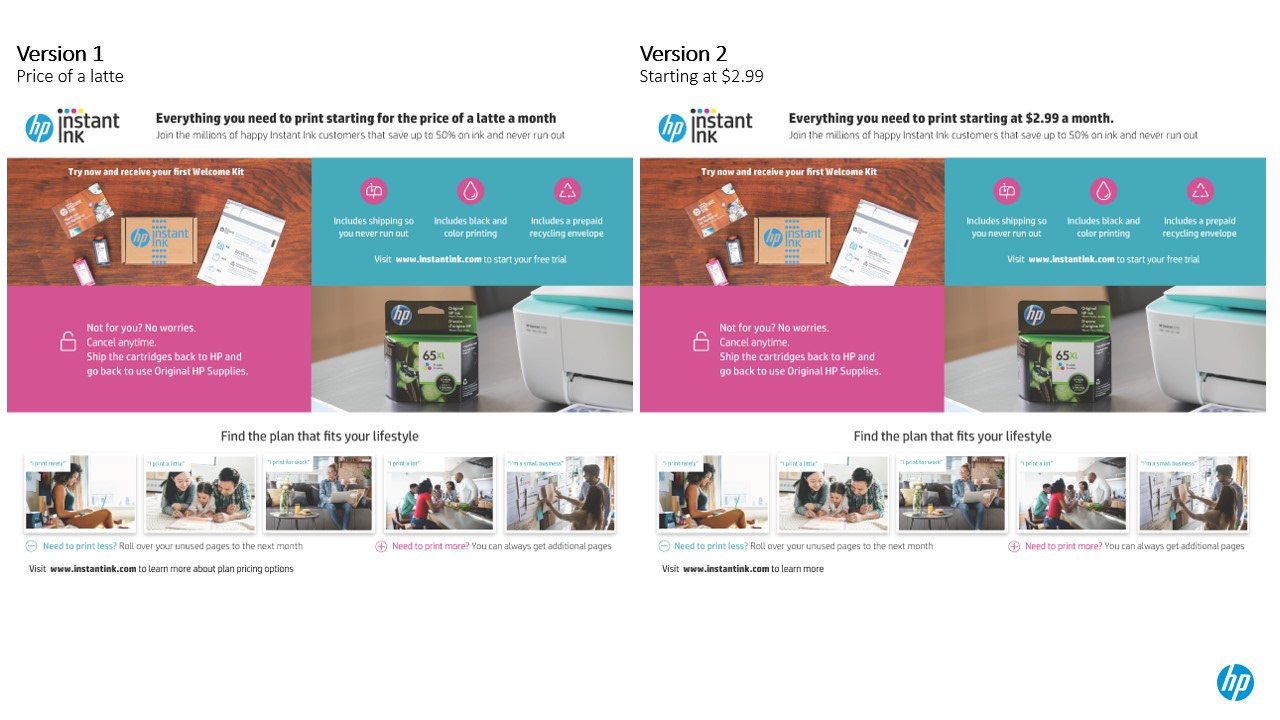
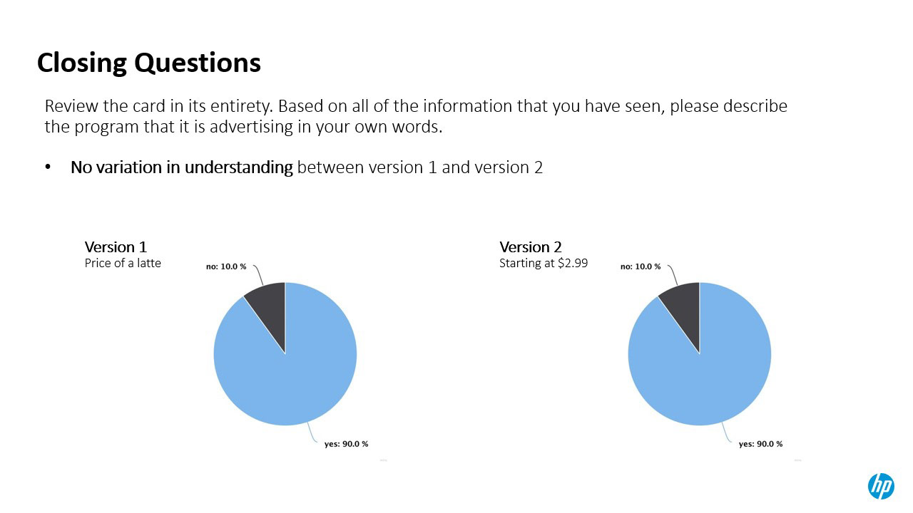
In round 2 stakeholders asked me to focus on the copy in the Header. We wanted to know if/how referencing a starting price in the hook would assuage users' concerns about the lack of specific price information. Version 1 included a vague reference price ("price of a latte") that would give users a general idea of the starting price point. Version 2 included a clear starting price ("$2.99 a month").
Ultimately I found that both headers had an equally positive impact. Including some reference to a starting price reassured users that the service was affordable and piqued many users' interest in taking advantage of the deal. I decided that moving forward with Version 1 would work well for our users and meet stakeholders' goals.
Round 3
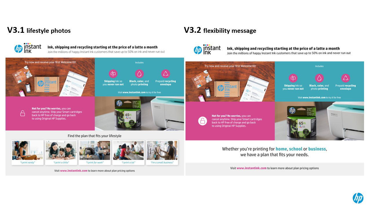
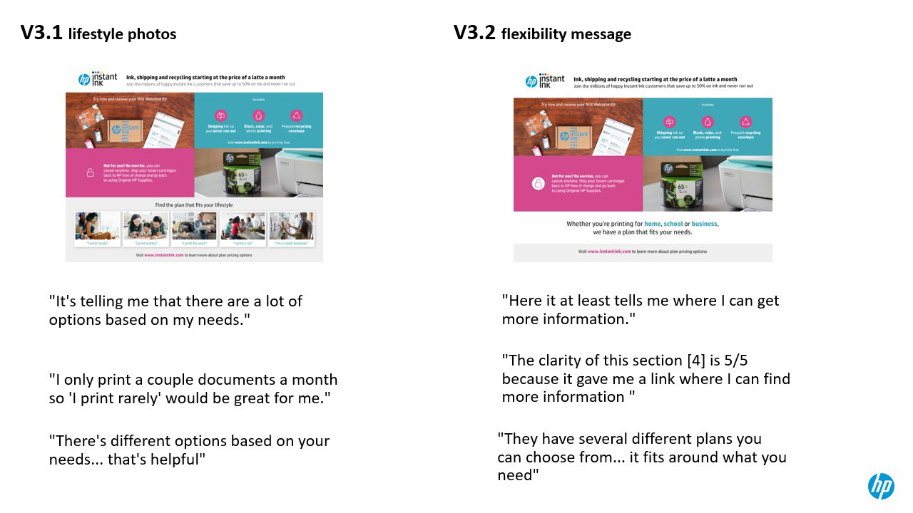
In the final round of testing we explored the design of section 4 of the card to determine the best approach to communicating the flexibility of our print plan tiers. Version 1 included labeled lifestyle photos meant to represent each plan tier and the type of user they're designed for. Version 2 used a "flexibility message" tagline to communicate the fact that there are multiple print plan options available for different types of users.
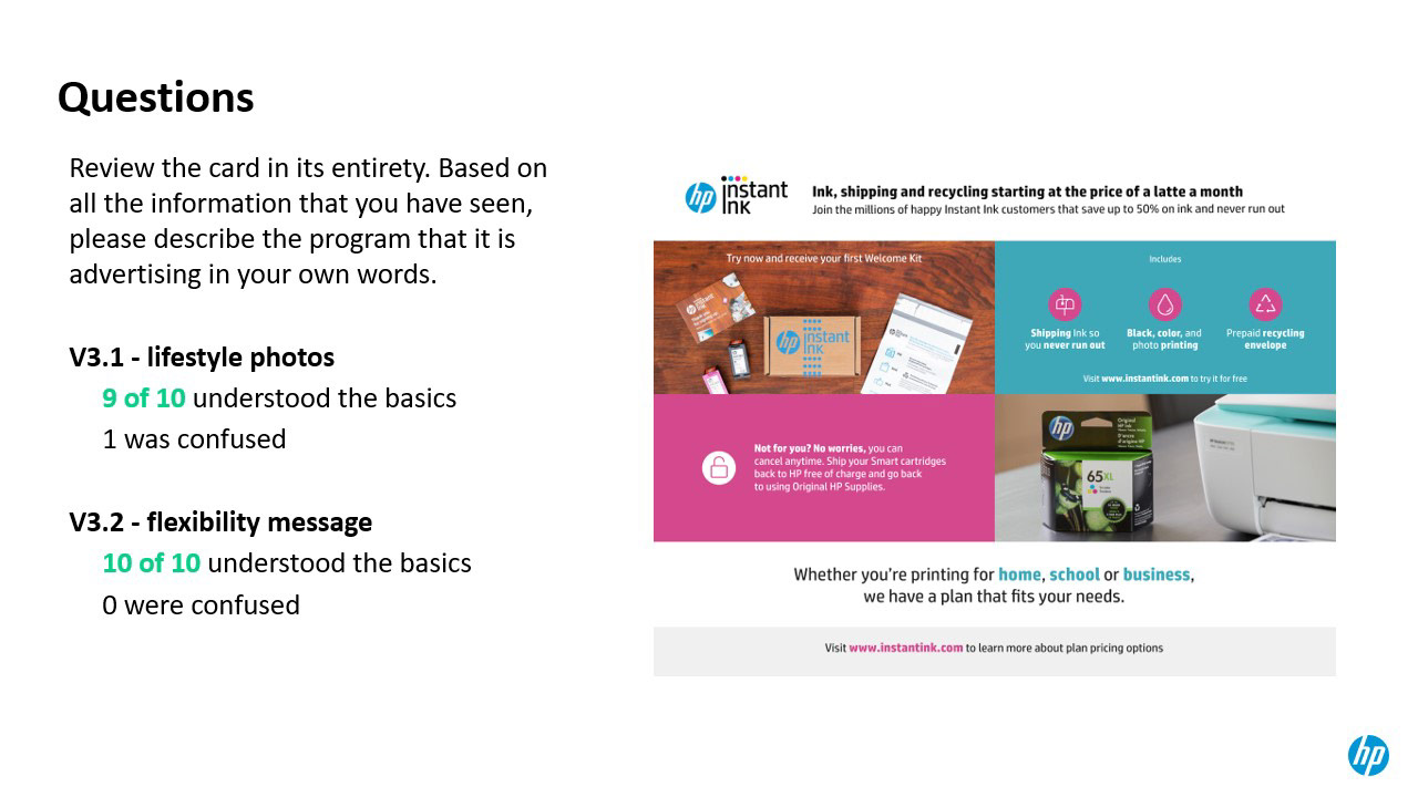
In the end I found that Version 3.2 was the strongest option. This version of the card effectively communicated the flexibility message in a concise and visually simple way ultimately lowering the cognitive load for users.
What's Next?
When it is safer for users to go back to retail shopping we plan to pilot test the new promotional card in stores using a unique URL, QR code, etc. to track traffic and subscriptions that are driven by this asset.